Failure to launch
- First published
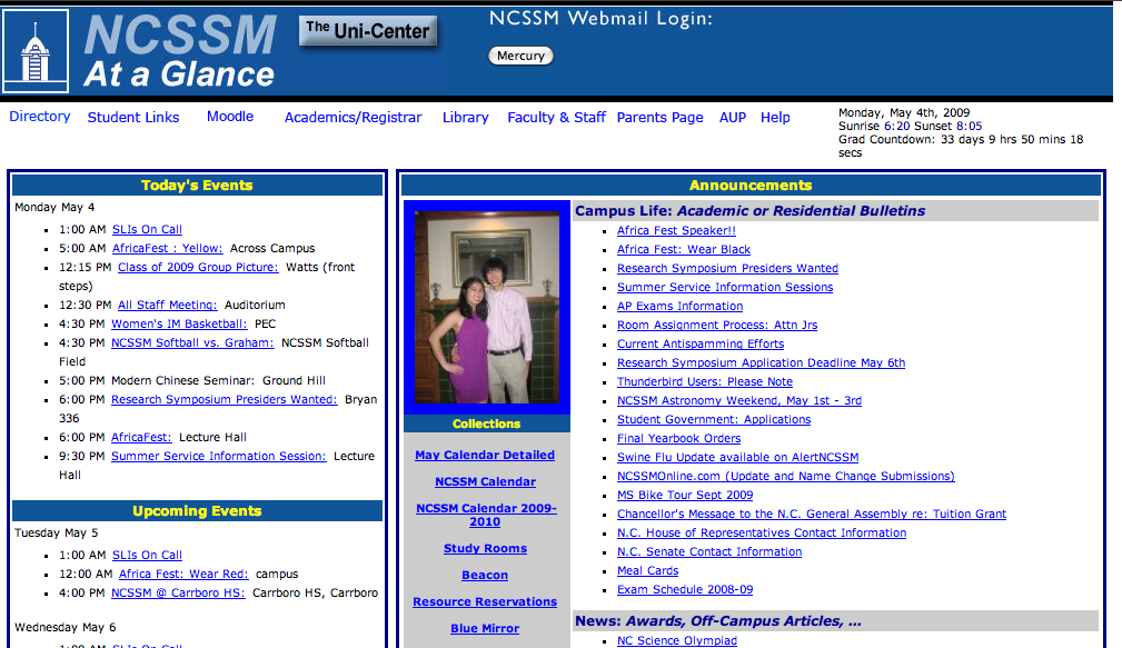
Anyone who’s been a student at NCSSM since about 2002 will instantly recognize the page in the screenshot above as At a Glance, the school’s one-stop shop for school news and events. AAG is hardly one of the most attractive things on the Web; it has a distinctly anachronistic feel to it, what with the ’90s-esque JavaScript drop-down menus in the header and a blocky table-based layout. None of that really matters, though — in fact, the design has a utilitarian feel to it, and that’s appropriate for a page that you just pop onto once or twice a day.
If I had to create a new version of At a Glance, a new design would in fact be rather far down the list of priorities. The back-end is where most of the real issues lie: no RSS or iCalendar feeds, the inability to view events on days past, undated announcements, forms and documents sorted by time of posting instead of by title…. A few of those things would be good to tackle first before trying to come up with a new page layout.
It’s unfortunate that the creators of NCSSM Connected, the heir apparent to the campus information portal crown, don’t seem to share that point of view. In the process of creating a new design, they’ve actually created more usability problems while addressing none of the substantial flaws in the original AAG — or, to borrow the words of Ben Yahtzee
Croshaw, like the old version, but a hell of a lot more broken.
1
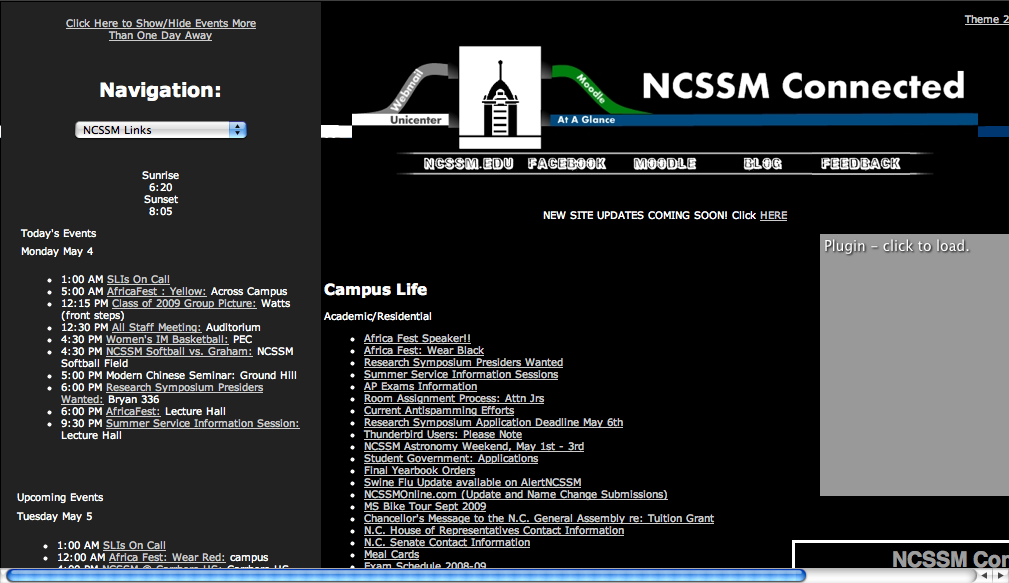
The biggest issue with this revamp is, well, how big it is. Both of these screenshots were taken with the browser viewport (the part with actual page content) at 1024 pixels wide. The original AAG feels right at home at this size, but the new version runs at least 200 pixels over that, forcing the addition of a horizontal scrollbar on even modestly-sized displays (and not everyone maximizes their browser windows, either). The NCSSM Connected
header, too, is about twice as tall as the old one, pushing more information below the fold. The increase in body size could at least have been used to accommodate larger, more readable text, but this opportunity has sadly gone to waste.
Speaking of readability, take a look at the page colors. I have no issue with the idea of using black as a background color, but combining the already-small type with lower contrast in the form of grays and… well, more grays2 is a recipe for disaster eye strain. Additionally, the highlighting background color on most of the subheadings has been removed, leaving random strands of unformatted text.

This is the header image, which I’ve reproduced here because the text on the pipe-cleaner things is easy to miss even at full size. Those words are supposed to be links, but if I hadn’t had that pointed out to me by a post on Facebook, I would have just dismissed them as pointless decoration. Appropriately enough, half of the links are unnecessary anyway: access to Moodle is provided by the more standard-looking (but still hard-to-read) navigation bar below, while the link back to the old AAG only serves as perhaps a tacit admission of how people might prefer it to the new stuff. It’s also strange how all of this effort was expended on the image map itself, but not on its placement: the pipes on the left and right don’t even properly connect to their background counterparts, as the overview image shows.
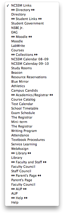
Meanwhile, over on the left side of the page lies this gem:

Yes, this single drop-down menu is supposed to serve as a replacement for the row of menus that the original AAG sported, plus the list of collections
running down the center next to the announcements. The contents, as you can imagine, are less than organized.
Finally, the source is an absolute disaster. AAG’s 2002 incarnation is by no means a paragon of code cleanliness, but at least the structure makes some amount of sense. NCSSM Connected, on the other hand, professes XHTML 1.0 Transitional compliance, a task at which it fails miserably. CSS declarations and scripts are all stuffed straight into the page header, the development blog box inexplicably relies on an external service, and <font> and <table> tags are sprinkled liberally throughout as if the markup were cupcake frosting. Oh, yeah, and there’s superfluous Flash.
I don’t mean to put down the idea of rethinking At a Glance, or what the people behind this effort have done so far, but it’s clear that this attempt is, as it stands, a botch. Even something with a beta
tag, which the creators of NCSSM Connected have so thoughtfully provided, should be an improvement over its predecessor. With these results, I’d say it’s time to take a couple of steps back and think about how to do that instead of wasting time on visual fluff.3