So close, yet so far
- First published
In Windows, maximizing a typical window pushes its close
button
right up to the top right corner of the screen.

This takes advantage of a human–computer interaction maxim called Fitts’ law, which in part tells us that the larger a screen target is, the easier it is to hit. With a mouse, the cursor won’t move past the edges of the screen no matter how much input it receives in that direction, so any target located on an edge has effectively infinite size beyond that edge. The corollary is that targets in a screen corner are especially easy to reach, because the user can just throw the cursor diagonally and let the corner catch it. Hence, user interfaces tend to put readily accessible actions at the edges of the screen, and reserve corners for really important things. It’s not a coincidence that nearly every desktop environment with a system menu button puts it in a corner.
If only someone would tell the people who make game launchers.
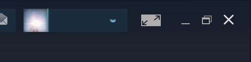
Steam is the oldest offender in our rogues’ gallery, offsetting its close button from the screen edge with a nine-pixel1 dead zone over half as wide as the actual button. Reaching the button is like a road trip composed of one part screaming down the highway in a sports car, followed by another equally long part in a box truck going in reverse at two miles per hour, the back-up alarm blaring in your ears the whole way.
Most of Steam’s windows look like this even on macOS, where the standard buttons don’t even go in that corner.

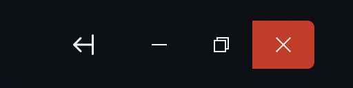
Origin gets this close to getting it right, where this close
is one pixel.
Yup, zoom into the image and you’ll find a border there that’s literally
a single pixel wide, but blocks off all the screen edges when maximized.
Alas.
Then again, I probably shouldn’t expect better from an app that still, in 2021, hasn’t updated to handle high-DPI displays.
On the other hand, GOG Galaxy’s close button floats aimlessly in a black expanse. Fits the space theme, I suppose. That is, until you scroll one of the app’s content views, most of which bleed underneath the window controls and turn them into an illegible, overlapping mess.

The only launcher to get even half credit is Epic Games’, which at least manages to get the buttons on the top edge, if not the corner itself.
In conclusion, game launchers need to stop drawing their own window borders, for crying out loud. Maybe after that, we can convince them to try out app architectures that aren’t just Chromium wrappers around Web pages.
A man can dream.
-
Pixel here means a logical pixel like the
pxunit in CSS, which actually maps to four physical pixels on my Mac’s Retina Display. ↩︎